

My Role: Userflows and Visual Design
Branding by Santosh Kalaimani
UX Audit by Shannon Michelle
The challenge
Etaprise had a functional field service platform, but its existing experience had become difficult to learn and inefficient to use. The visual identity also needed a more modern and confident direction.
Complex workflows
Core operational tasks required users to understand a complex interface.
High learning curve
The product was not intuitive enough for new users, making onboarding more demanding.
Outdated visual language
The existing branding did not communicate the capability of a modern SaaS product.
Product audit
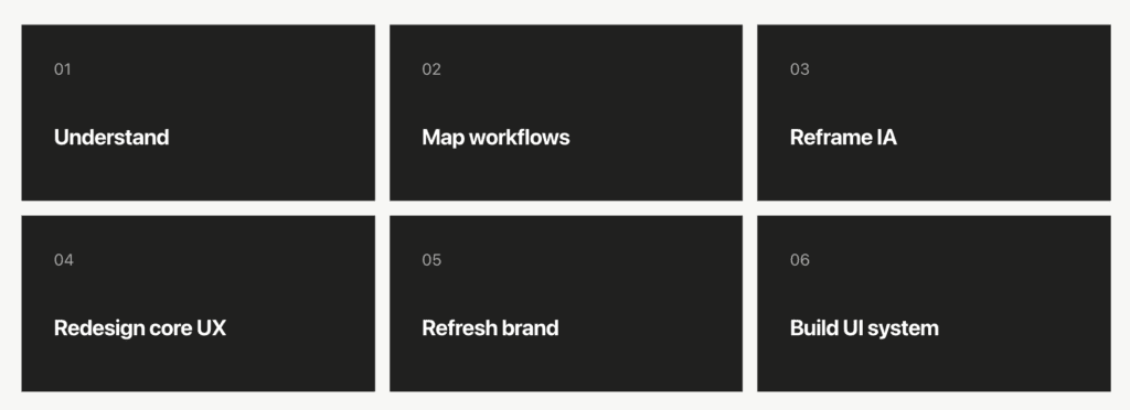
We started by understanding the existing product: where users spent time, where information became difficult to scan, and which workflows created the most friction.
The goal was more than a visual redesign. We rethought how field-service teams understand jobs, people, priorities and schedules turning dense operational data into a clearer, more visual working environment.
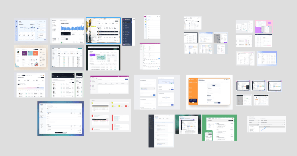
Competitive & Market Research
We studied leading field service platforms to understand existing patterns across dispatch, scheduling and triage.
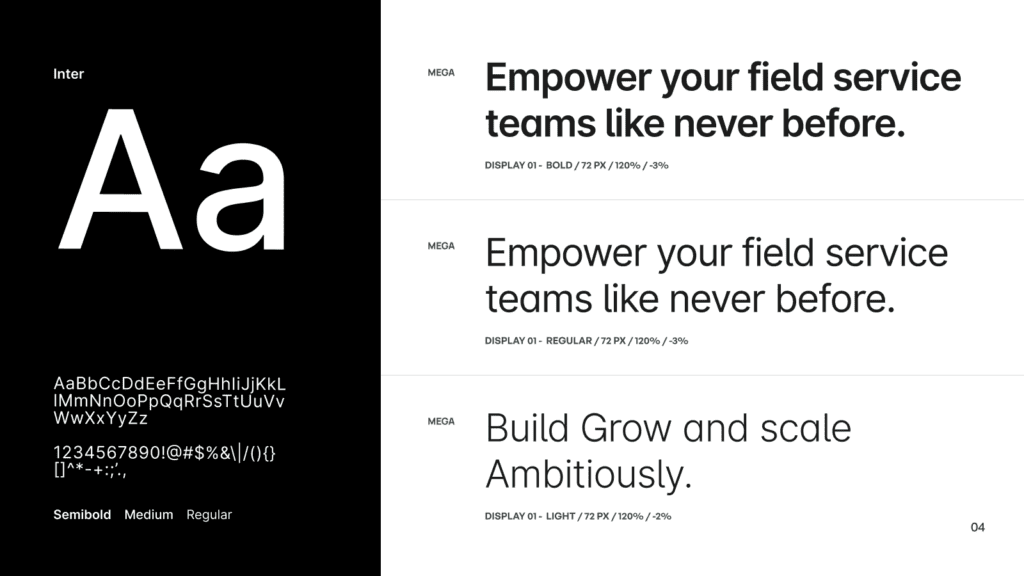
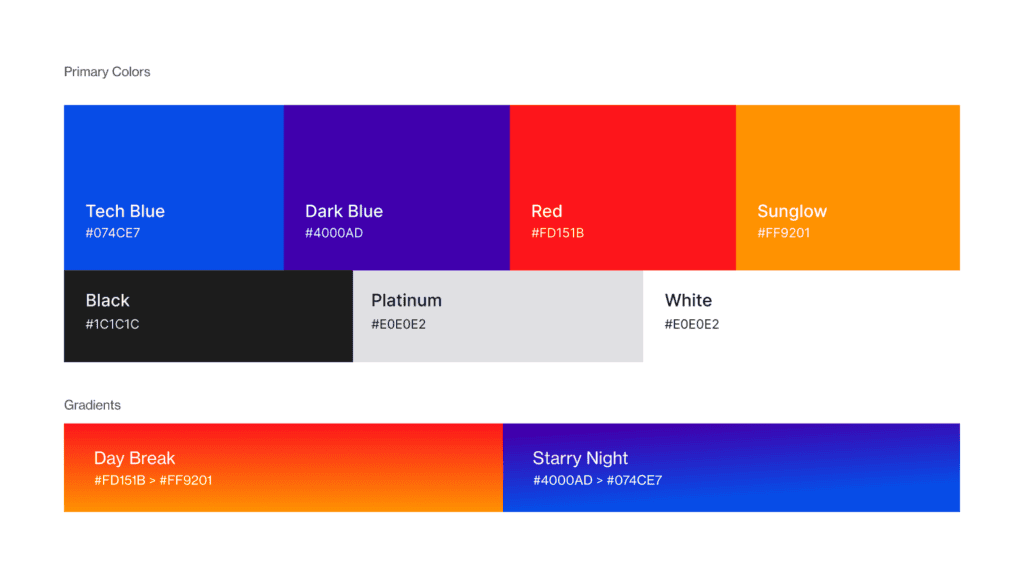
Brand Refresh
The UX transformation was paired with a visual identity refresh, creating a cleaner and more forward-looking foundation for the product.


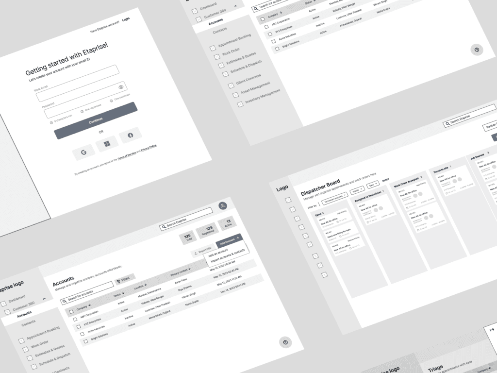
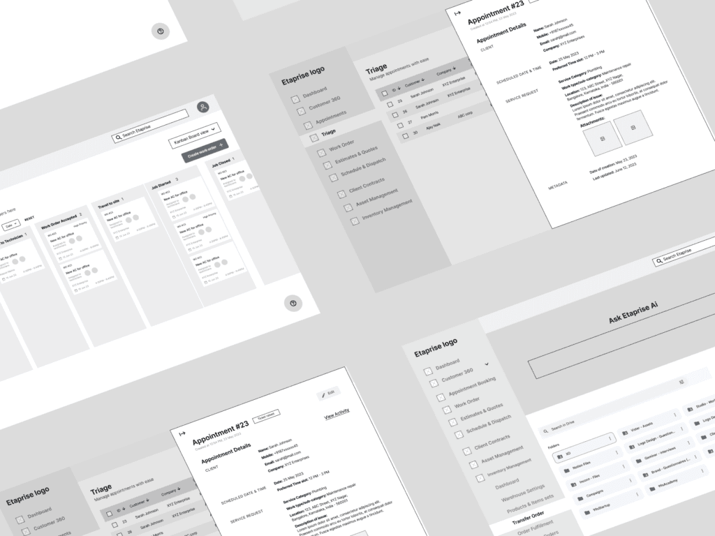
Wireframes & IA
The product structure was reorganised around the jobs users needed to accomplish, creating clearer relationships between dispatch, scheduling, triage and the supporting modules.
Core UX transformation
The largest redesign effort focused on three operational modules where speed and clarity matter most.
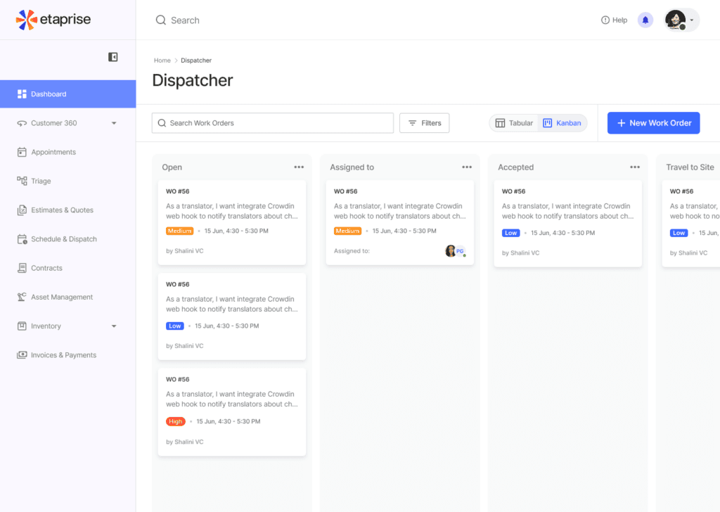
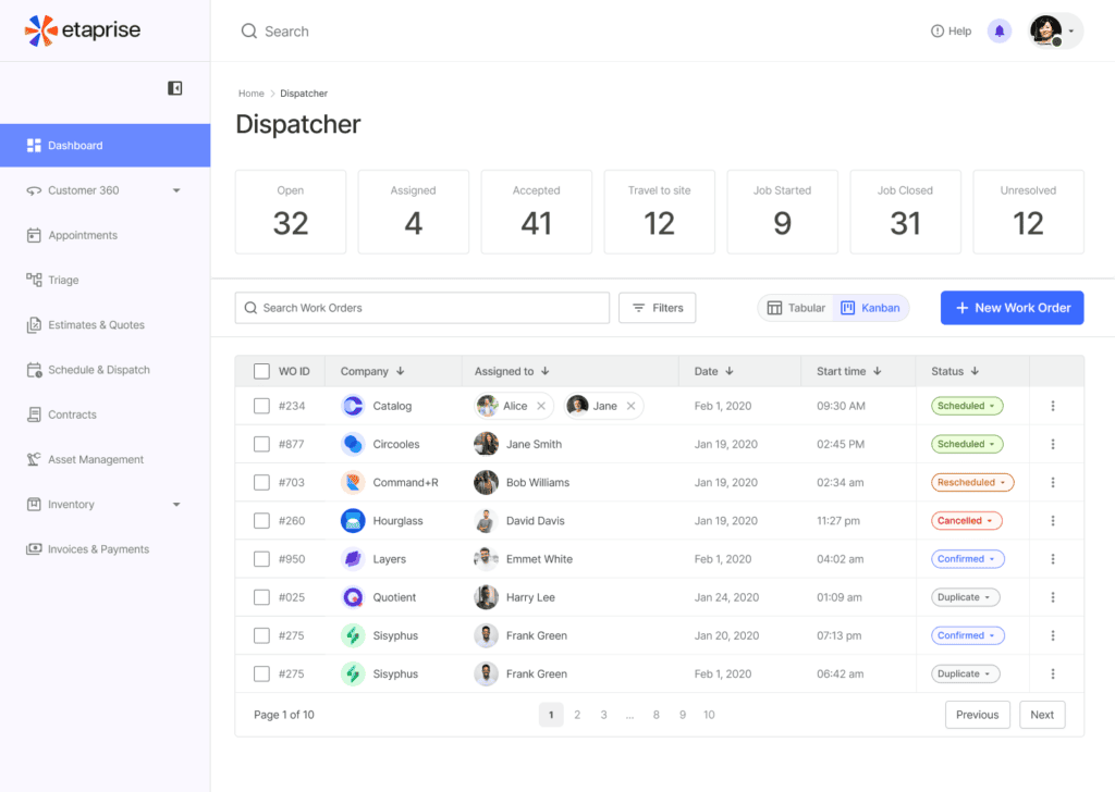
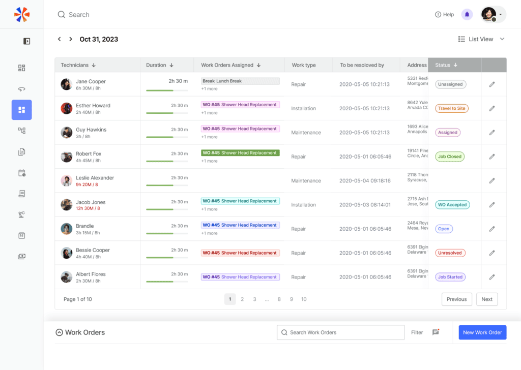
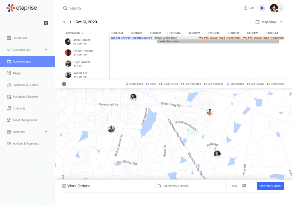
Dispatcher
A more visual command centre with Kanban for understanding jobs, technicians and daily operations at a glance.
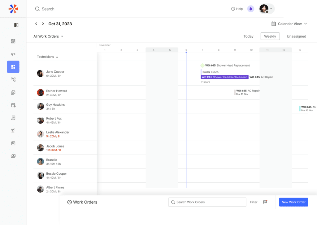
Scheduler
Scheduling was redesigned to make assignments, availability and conflicts easier to understand, helping dispatchers make decisions without navigating through multiple screens.
Triage
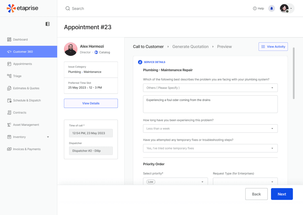
Triage experience was simplified so teams could quickly assess incoming work, understand priority and move jobs into the right operational path.
From data-heavy to visual
This key design principle was to reduce the cognitive load of operational screens.
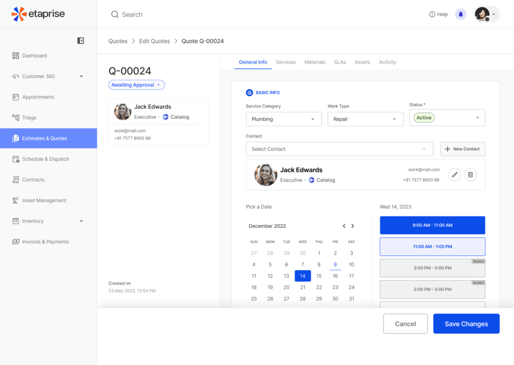
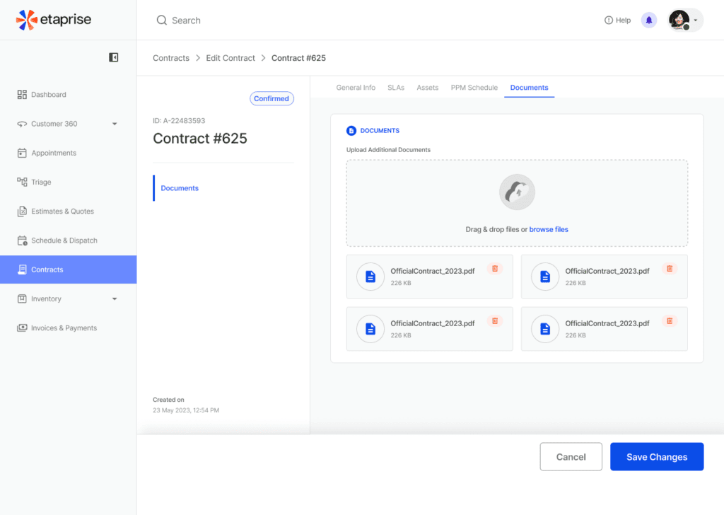
“The redesign turned complex field-service operations into a more visual, intuitive and actionable experience.”
The outcome
Faster operations
Reduced the steps and navigation needed to manage everyday field-service tasks.
Quicker decisions
Made jobs, schedules, technician availability and priorities easier to assess at a glance.
Faster Training
Simplified core workflows so new users could understand and use the system faster.